2012年2月29日星期三

my design about king buffet


I get this case from newspaper,update ads about king buffet,the first is old one.so the nice one is my design, find some food image to add.thanks!


Illustration Fridays Challenge #8 Capable


Original art from a paperback cover
Illustrated by Walter Wyles
Year unknown

* Courtesy of Bryn Havord
love this painting so much. Beautiful use of color, sober and elegant, the heroine wearing a cool white shirt with a summer straw hat. Shows the painting's creation time, summer, and I really like the performance of the of the sky background first of all daysis blue, and finally add some white, so you can make the sky not too blue, but not beach integration.


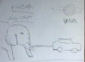
A new word for this week, Capable.  let me explanation my three design first.
my idea about capable is powerful and Professional. My first design is a hammer, the hammer above my painting is a pair of fists, a fist is very hard, the hammer is very hard tool, both have the same meaning, hard-hammer and fists have capable.

The second is to highlight the chef's hat chef's hat to the higher level, said he, so I draw a hat  is higher, Demonstrated his ability.


My final last design is in stark contrast to a car advertising, car and elephants, if the car can pull the elephant show that the performance of this car is very good.


Illustration Fridays Challenge #7fluid


"Trees" (personal work)

Painted by Walter H. Everett

October 22, 1945

This painting is so beautiful, albeit a tree, but the author leaves and light the shadow of the light is perfect. Feel that the creation of the painting the whole picture from the point of view, is about an afternoon of autumn, the leaves green and yellow, the weather in the cold.
The author of the painting, I really like, especially the performance of the leaves look like. He used some brushes. Do not feel fine, but very neat, and rules.


thinks about fluid, just like water,wine or bleed.I designed three different designs, I chose the bleeding, I designed a theme for this, love yourself.
Many young people sometimes feel bored and empty, so will a knife to cut yourself, seeking the blood slowly out of the pleasure of leaving the wound in his arm.
This is a how absurd, so I will design a simple ad, tell people to care for themselves.
First, set the background is black, add a ban on the flag, and finally add a cut arm from inside the bloodshed.


2012年2月26日星期日

logo design for CD


The customer want the CD logo looks cool, not to much colours,use Marijuana for the back. make small  CD icon  . now, i don't know which one him will using.

2012年2月22日星期三

Improve ads from newspaper

i get this improve work from Hamilton chinese press, just improve this gift ads more looking nice and simple.


2012年2月14日星期二

Illustration Fridays Challenge #6 popularity


i choice this lovely art work have Two reasons. first, Colors to coordinate, the outlook is bright and dark background, the sensitivity to very good use of the painting features a very good performance out of the shadow. Such as tablecloths, face and clothes wrinkle. gentleman oder the food. ladies watching the men, his eyes showing love  to the men.


first idea about this word is Outstanding contributions peoples. Sports champion ,  Superman and  pianist 
beethoven.I chose Beethoven, to design a CD cover. First ,set the background color is black, black symbol of mystery, professional portrait of Beethoven's in the middle, the edges become blurred. Adding text, Beethoven's full name and the CD name .of the four corners by adding a beautiful pattern .on topadd sheet music staff, a symbol of this is a music CD.


2012年2月3日星期五

love hamilton!


Illustration Fridays Challenge #5 suspense


this nice art work from peng's flickr,Straightforward to show the artist's style, the curved line is very casual. Very beautiful colors. Painter didn't drawing the horses in the middle, but on the right side. Give me an illusion, like a zebra, but the zebra should not be black and white ?right? simple but useful to create art , I really like it.


 suspense

For this week, the word is suspense,I will think of  horror film. One wearing a white dress, long black hair, pale face is always watching at the side.So, my design like this, but I want to highlight the word suspense, I would drawing eye more look like Fear, panic.
first, i using brash tool drawing my  Subject, Followed by a Halloween haunted house in the background, with red color to highlight topic watching you.thanks,see u next challenge!